April 2, 2026
.webp)
Your brand is more than a logo—it's the entire visual story that tells customers what your meal prep business stands for. From your choice of colors to how your menu typography looks online, every design decision influences whether potential buyers see your service as convenient, healthy, eco-friendly, or premium.
In fact, research shows two-thirds of adults believe brands should help them make healthy choices (Mintel). For meal prep businesses, that means branding isn't just about looking good; it's about building trust and nudging customers toward your service instead of a competitor's.
This guide covers inspiration, strategy, and actionable steps to design your meal prep brand identity—logo, color palette, typography, and consistent imagery.
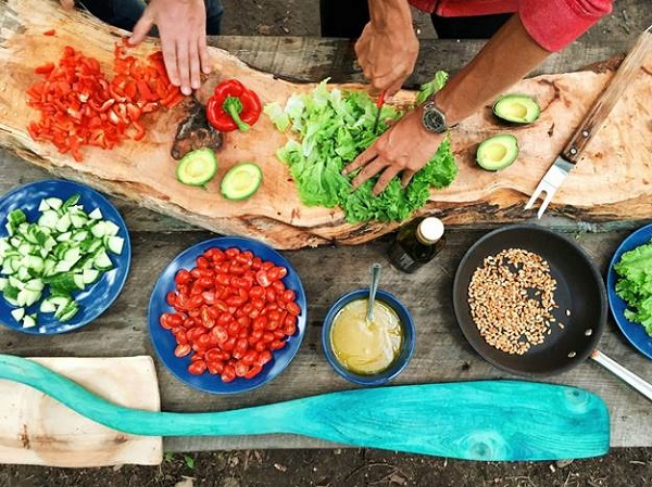
When starting, most meal prep entrepreneurs ask: What should my branding look like? The truth is, before you can refine your strategy, you'll need inspiration. Competitors like Pinterest or 99designs dominate this "inspo space," but leave you without any practical guidance on execution.
Here are three branding archetypes meal prep businesses can learn from:
Healthy & Organic – Clean logos, lots of white space, soft green palettes, and nature-inspired iconography (leaves, water droplets, plants).
Gourmet & Premium – Dark backgrounds, gold or black typography, minimalist logos, often serif fonts to convey luxury.
Convenient & Affordable – Bright, high-contrast colors (orange, yellow), rounded typography for a friendly approachable feel, bold icons like clocks or fast-delivery cues.
Each aesthetic connects back to core customer values—freshness, luxury, or convenience.
Meal prep customers don't just buy food—they buy reassurance. They want to feel:
Healthy: Colors like green instantly connect to health and freshness.
Time-Saving: Simple, minimalistic design communicates your product is easy to navigate and purchase.
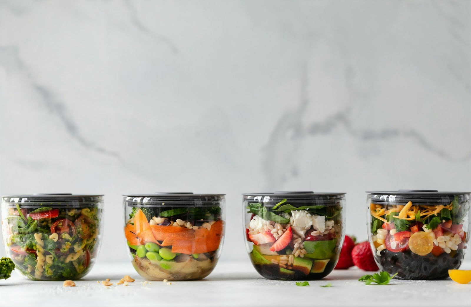
Eco-Friendly: Packaging design impacts trust—20% of consumers cite waste as a major concern (IJNRD).
Even typography matters—bold sans-serif fonts are trending in meal prep because they're legible on everything from mobile menus to SMS links.
Now, let's break down the three most critical branding decisions: logo, color, and typography.
A meal prep logo should be:
Types of logos to consider:
Wordmarks – Think simple text-based designs for modern brands.
Pictorial Marks – Symbols (like a fork + clock) that reinforce brand values.
Combination Marks – Most effective for meal prep: pairing your name with a recognizable icon.
Colors provoke instinctive responses:
Green → Health, organic, plant-based options.
Red/Orange/Yellow → Energy, appetite stimulation, "grab-and-go" affordability.
Black + White → Premium, luxury, gourmet positioning.
Example Palettes by niche:

Fonts directly shape perception:
Sans-serif fonts (Helvetica, Lato): Clean, modern, health-oriented.
Serif fonts (Merriweather, Playfair): Traditional, gourmet, premium look.
Display fonts: Use sparingly for accents in packaging, not menus.
Pro tip: Pair one primary font for headings (brand personality) with a neutral sans-serif for body text (clarity on mobile and packaging).
Here's how values translate into design choices:
This process ensures that what you promise verbally—convenience, freshness, quality—matches what your customer sees visually.
Your logo anchors your identity, but consistency across colors, fonts, and imagery is what builds recognition.
Start with customer psychology: Green signals health, orange/yellow signals convenience, and black/gold signals premium. Match your brand values with customer expectations.
Typography affects legibility on menus, apps, and packaging. The right pairing communicates professionalism and improves conversions online.
Yes. Research shows branding elements like packaging and color shape customer trust, and in the meal prep market, that trust is directly tied to whether someone subscribes or reorders.

Your visual branding is more than aesthetic—it's a business tool that directly drives trust and sales. Whether you position your meal prep service as fresh, gourmet, or convenient, you need a logo, color palette, and typography that reinforce those values at every touchpoint.
At Bottle, we help meal prep entrepreneurs move beyond inspiration into execution. Our all-in-one platform doesn't just streamline operations and marketing—it ensures your visuals, menus, and customer experience stay cohesive.
Your next step? Review your current brand identity and ask: Does it reflect the values I want customers to associate with my meals? If not, it's time to refine.
Ready to start building a stronger meal prep brand? Join our community of entrepreneurs, and let's design a brand that looks as good as your meals taste.
👉 Explore Bottle's platform for meal prep businesses to learn how branding, websites, and SMS marketing come together to drive growth.